
Your team has been accepted into an amazing soccer showcase tournament. All of the players and parents are excited about playing in front of colleg
Your team has been accepted into an amazing soccer showcase tournament.
All of the players and parents are excited about playing in front of college coaches against great competition.
You’ll be preparing yourself and your players in the days leading up to the showcase.
During the tournament, you’ll be patrolling the sidelines, handing out recruiting flyers to college coaches.
Will your team’s recruiting flyer help or hurt your team?
I’ve been working on perfecting a team’s recruiting flyer for years now, and I believe I have finally developed the anatomy of the perfect recruiting flyer for soccer showcases. Dozens of NCAA coaches have complimented this design, and managers from other clubs have asked (very politely — you rock, Oceanside Breakers) if they could have one so they could replicate the layout.
Here is the anatomy of the perfect recruiting flyer:
THICK MATTE PAPER! Use card stock with NO GLOSS. Coaches want to be able to write on the flyer with whatever pen they have handy. Glossy paper is from the devil.
SINGLE FOLD! Tri-fold flyers look snazzy, but they’re confusing. It’s difficult for coaches to decipher any particular order of the info inside, and the flyers always end up folded incorrectly. Keep it simple with a single sheet of thick matte card stock with a single fold.
COACH’S CELL PHONE front and center! Be sure to have a picture of your coach with his/her cell phone number prominently on the cover. NCAA rules prohibit college coaches from contacting high school players, but club coaches can be contacted.
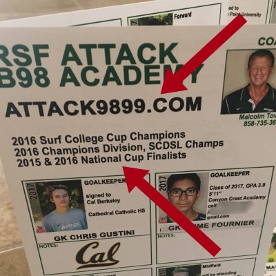 TEAM NAME, ACCOMPLISHMENTS, and WEBSITE front and center! Have your team’s name prominently at the top, along with the team’s best accomplishments. If your team has a recruiting website, include that link, too. Simple web addresses (URLs) are best. If you don’t have a team website, you can purchase a .com from GoDaddy and simply have it re-direct to your team’s GotSoccer page. OR, contact me if your club’s board would like to talk about making recruiting websites for all of your teams.
EASY-TO-VIEW PHOTOS! Each player should have his/her own section with a photo. The photo should be recent, and head/shoulders only. Since the actual photo on the paper will be quite small, crop the photo so that a college coach will be able to clearly see the face and match that with the player on the field. Teenagers will make this difficult, but try to have the photo match the player’s current hair style/color.
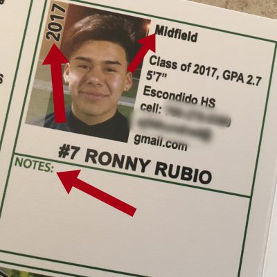 EASY-TO-READ PLAYER INFO! Be sure to make the graduation year prominent for every player. Include the player’s name (duh), jersey number, grad year, position, height, email address, cell phone, high school, GPA, and possibly SAT/ACT test scores if the player wants that included. If a player is blazing fast (speed kills), include the 40yd dash time.
NOTES SECTION! Be sure to leave room for college coaches to make notes. Each player should have space for notes, and you can leave more room for notes if your roster doesn’t fill up all of the room on the flyer.
QUALITY PRINTING! They didn’t pay me to say this, I swear. If you’re local to San Diego, Print & Copy House in Encinitas is amazing. The turnaround time is great, and the quality is even better.
DON’T TRY TO BE SNAZZY. A few years ago, I walked past a college coach trying to make sense of a recruiting flyer handed to him by another team. The flyer was eye-catching. It looked like something out of a marketing presentation from a hip start-up hoping for angel investor seed money. It was awful for college recruiting. Do your team a favor and leave the snazzy marketing material away from the recruiting flyer.
If you use this layout, you can easily modify it to include 16-22 players by making more “notes” sections or increasing/decreasing the size of the team’s info section on the front.
Good luck at your showcase! (and don’t get hurt)